Mathletics Teacher Centre Redesign
Role: Lead UX/UI Designer
Team: CPO, Product lead, Product manager, BA, Engineers, Junior designers, Sales and Customer success
Tools & Methodology: Figma, Hotjar, Google analytics — Design Thinking (Double Diamond), User Interviews, Competitive analysis and system auditOutcome: Streamlined workflows, improved consistency, and enhanced teacher satisfaction.
Project Overview
Mathletics is used by over 3 million students globally. I was tasked with redesigning a critical part of the legacy system — the Teacher Centre — to improve usability, reduce assignment friction, and deliver clearer performance data for teachers.
We focused on revamping two key areas:
Assigning tasks: Teachers struggled with a fragmented, inconsistent assigning flow.
Results Reporting: Lacked visibility into student progress, making it hard to adapt teaching in real time.
We focused on revamping two key areas:
Assigning tasks: Teachers struggled with a fragmented, inconsistent assigning flow.
Results Reporting: Lacked visibility into student progress, making it hard to adapt teaching in real time.
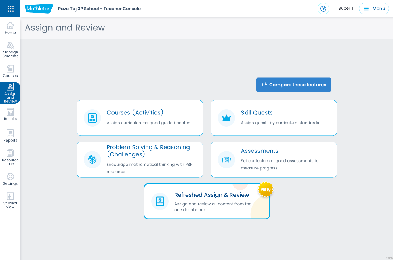
Here’s the New Design
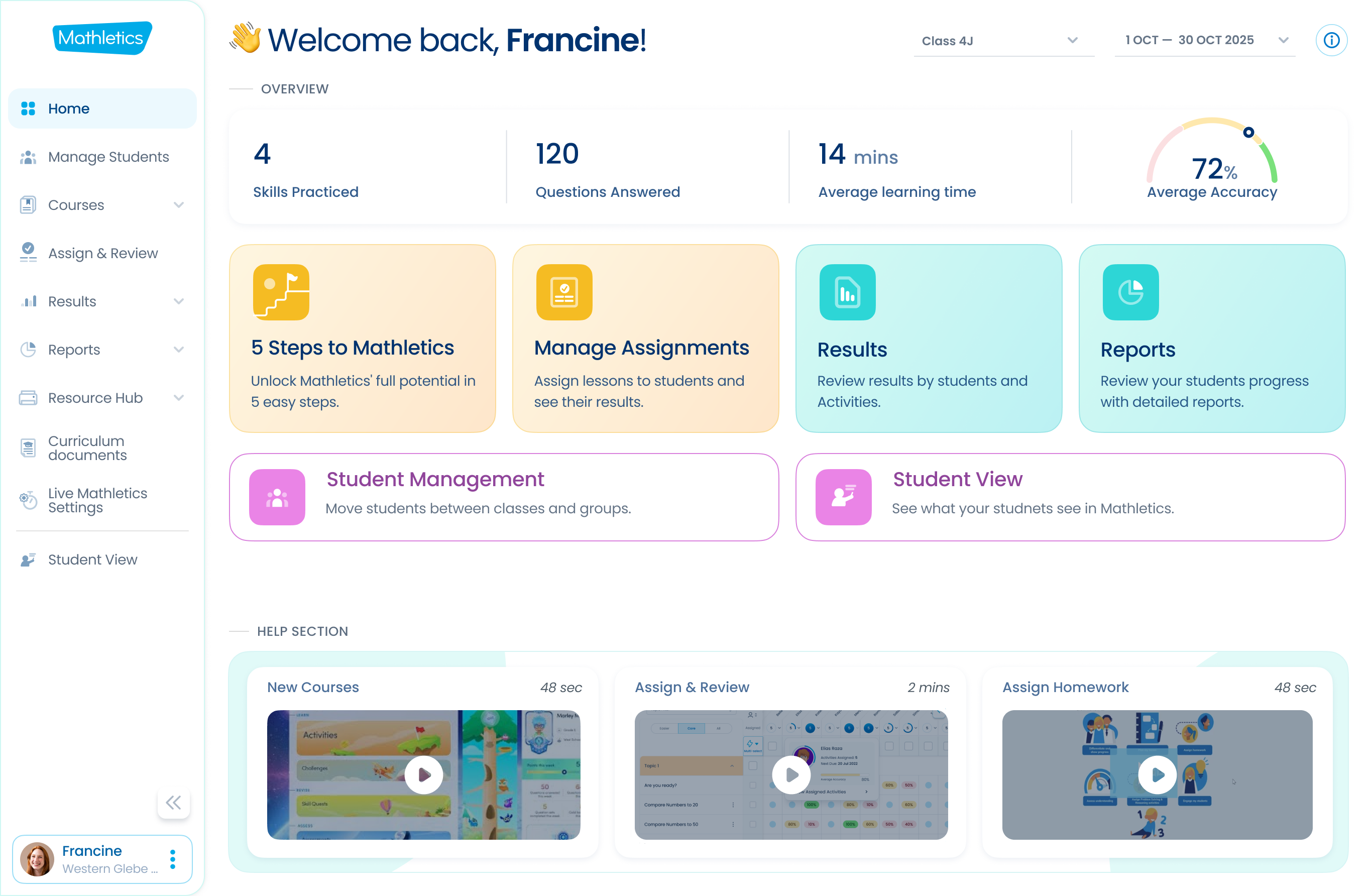
The Home Screen currently offers limited value for existing teachers. These cards are primarily designed to assist new teachers with onboarding.
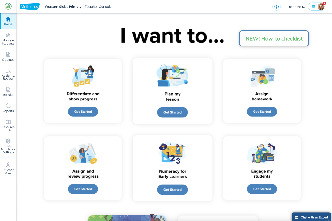
The Challenge
The existing Mathletics Teacher Centre presented several critical usability issues that significantly impacted teacher efficiency and satisfaction:
Fragmented Experience: Teachers encountered inconsistent workflows and interfaces across different sections of the platform.
Structural Problems & Information Hierarchy: The content was poorly organized, making it difficult for teachers to locate relevant information and functionalities quickly.
Lack of 1-1 Relationship (Teacher Portal & Student Centre): There was a disconnect between the teacher and student views, hindering teachers' ability to understand and track student progress effectively with inconsistency terminology across both platform.
Limited Value for Existing Teachers: The platform failed to provide ongoing value and tools that genuinely supported experienced teachers in their daily tasks. Inconsistency & Poor Interaction Design: The overall design lacked consistency, leading to a confusing and frustrating user experience.
Problem Statement
"Assigning is complicated and frustrating for teachers, and there is no consistent way to assign tasks to students. Teachers abandon the assigning process and give up. The process of Assigning is different in each of the Mathletics content areas (i.e., New Courses, Skill Quests, Challenges, and Assessments)."
Here are the old screens(Assign & Review)
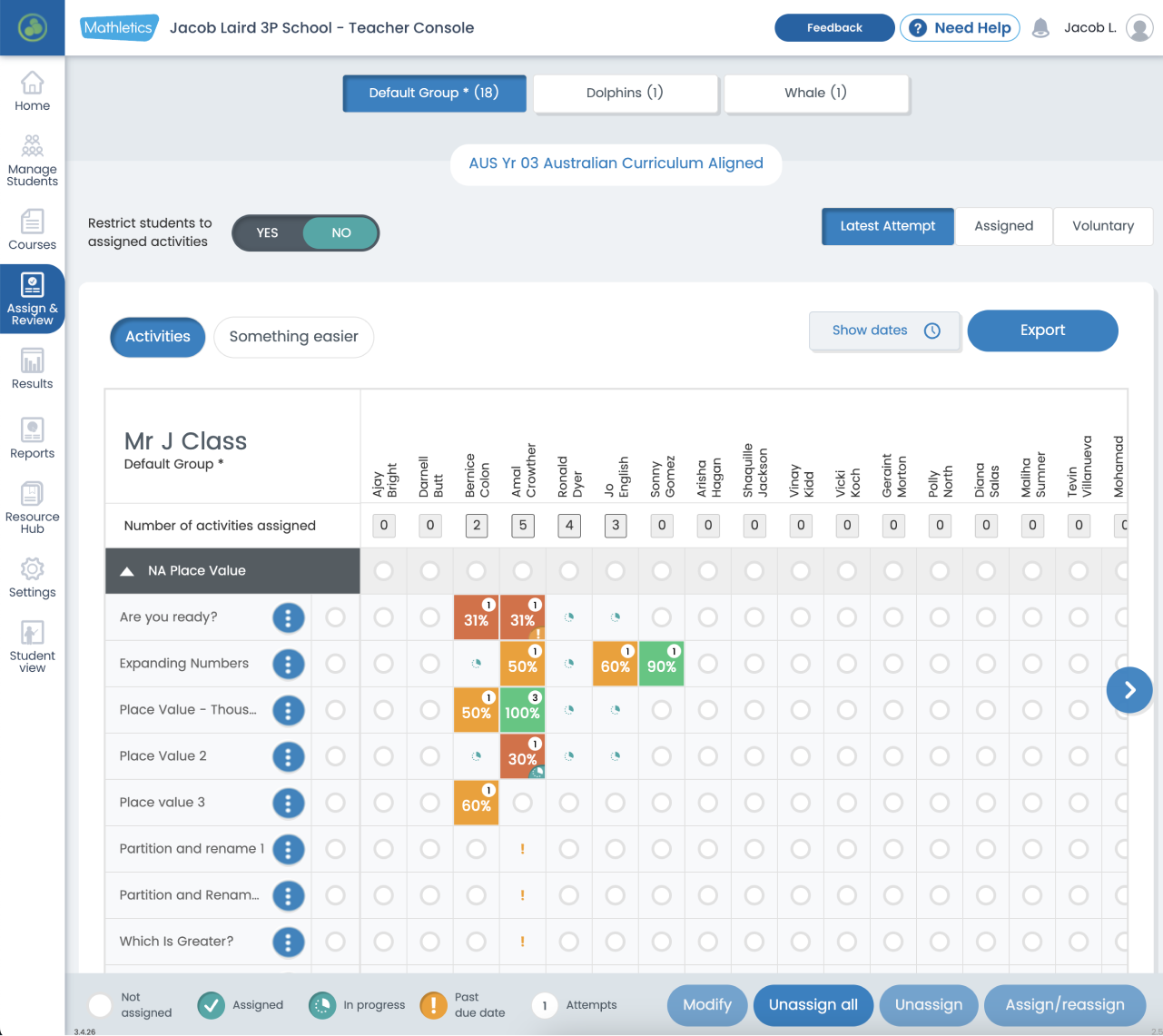
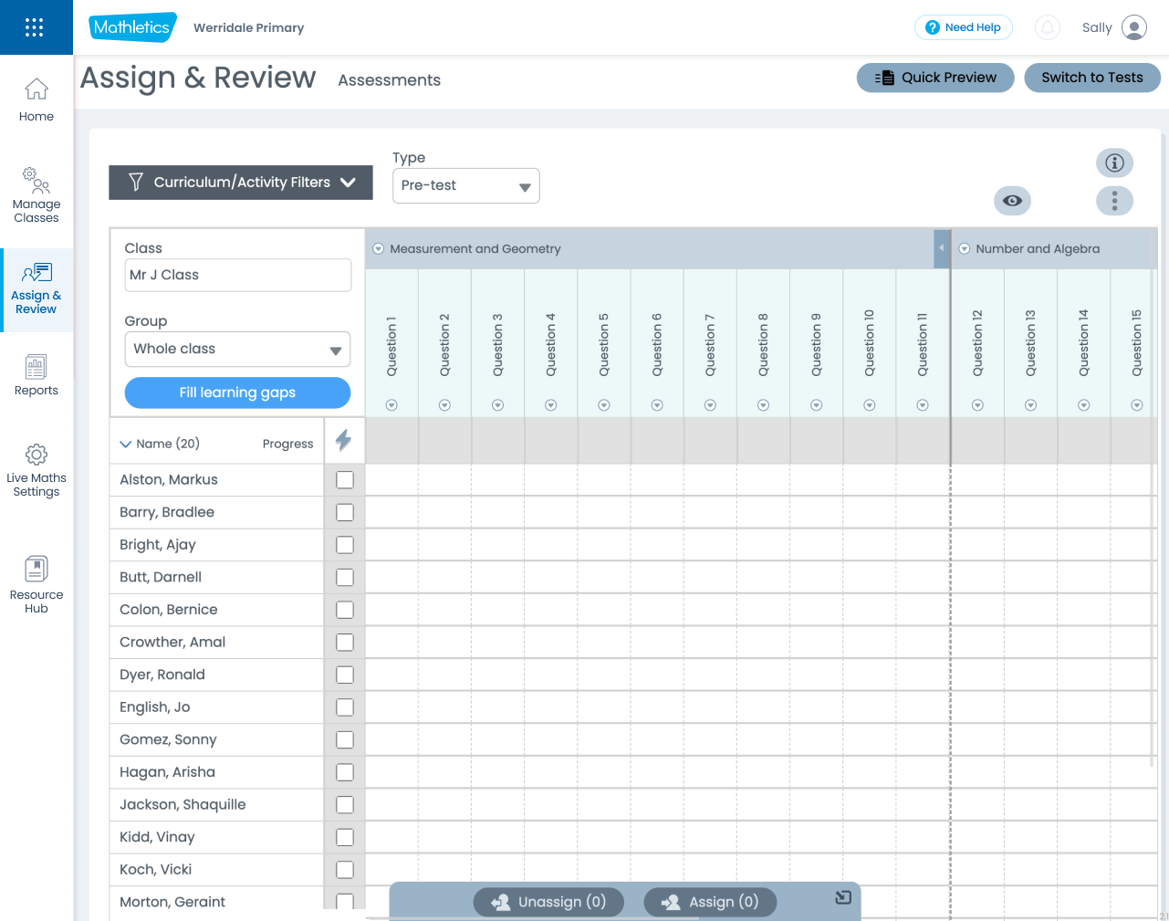
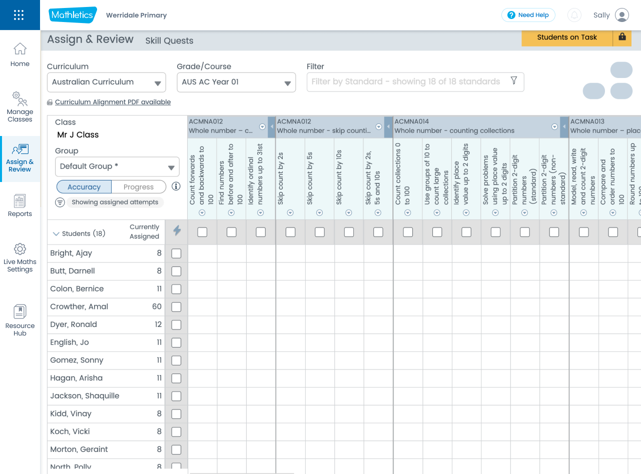
One comment from the teacher was "I don't want to crick my neck when assigning tasks.”
Goal
"Simplify and streamline assigning for teachers. Make it user-friendly, quick, consistent, and a delightful experience for teachers."
My Design Process
I adopted the Design Thinking Double Diamond process to ensure a comprehensive and user-centered approach: Discover, Define, Develop, and Deliver.
01
Discover
During this phase, my focus was on deeply understanding the existing problems and user needs.
- User Research: Conducted extensive interviews and conversations with teachers, sales teams, and customer support to gather qualitative feedback and insights into their pain points, motivations, and desired outcomes.
- Behavioral Analysis (Hotjar): Utilized Hotjar video recordings to observe how teachers currently interacted with the platform, identifying areas where they spent significant time, encountered friction, or abandoned tasks. This provided crucial quantitative data on user behavior.
- Technical Audit: Investigated device usage and common screen resolutions to ensure the redesign would be responsive and accessible across various environments.
- User Journey Audit: Performed a thorough self-audit of the entire teacher user journey, meticulously documenting pain points and areas for improvement.
- Competitive Analysis: Explored other educational products offering similar solutions to understand industry best practices and identify opportunities for innovation.
This discovery phase confirmed the core problems: fragmented experiences, structural content issues, poor information hierarchy, lack of teacher-student portal synergy, limited value for existing users, inconsistency, and poor interaction design.
We collected references of similar products to see how they are approaching it. Below is from Khan Academy.
02
Define (Synthesize & Prioritize)
In the Define phase, we synthesized the research findings to clearly articulate the core problems and prioritize the most impactful areas for intervention.
Clear Objective:
To simplify, streamline, and make the assigning process user-friendly, quick, consistent, and delightful for teachers.
- Key Problems Identified:
- Fragmented experience.
- Structural problem: the way content is structured.
- Hierarchy of information.
- No 1-1 relationship between Teacher portal and Student centre.
- No value for existing teachers.
- Inconsistency.
- Poor interaction design.
- Refined Problem Statement:
The overarching problem was the complicated and frustrating assignment process, characterized by inconsistency across different content areas (New Courses, Skill Quests, Challenges, and Assessments), leading to abandonment.
Clear Objective:
To simplify, streamline, and make the assigning process user-friendly, quick, consistent, and delightful for teachers.
03
Develop (Ideation & Prototyping)
This phase involved brainstorming solutions and translating them into tangible designs.
- Ideation:
Based on the defined problems and objectives, we explored various design solutions to address the identified pain points.
- Prototyping:
Created interactive prototypes to visualize the proposed changes and allow for early testing and feedback.
The purpose of this interactive prototype is to validate our core assumptions by engaging internal and external Teachers. Their feedback will be crucial in iteratively evolving the design to align precisely with the objective and strategic business goals.
Design Improvements
Simplified Navigation:
A cleaner, more intuitive left-hand navigation bar.
A cleaner, more intuitive left-hand navigation bar.
Teacher Feedback and Key Insights: New Assign and Review Prototype
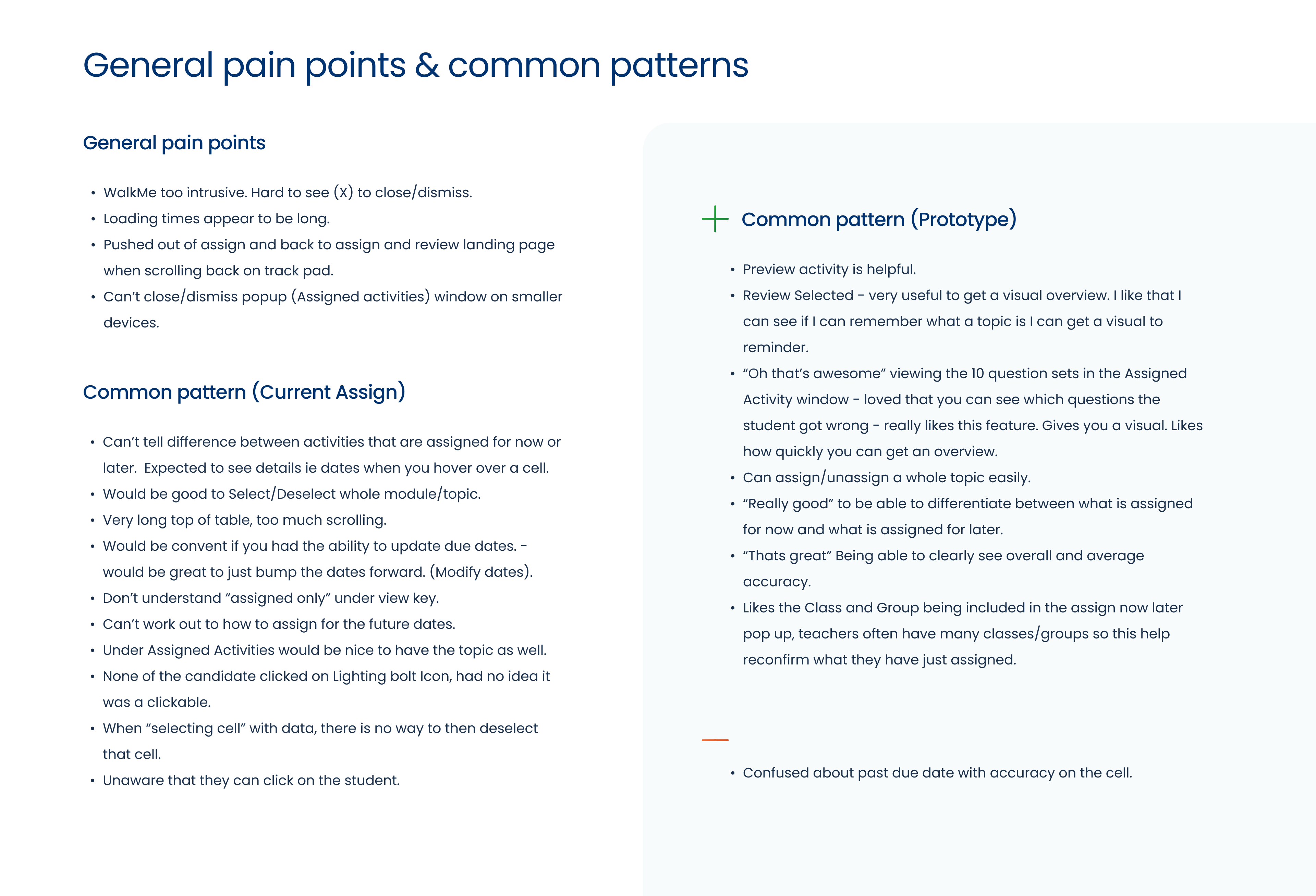
Pain point:
When teachers click on a card, it takes them directly to a specific activity, but there's no back button. To return to this screen, teachers have to click 'Assign & Review' again, which can be confusing and disruptive to their workflow.
When teachers click on a card, it takes them directly to a specific activity, but there's no back button. To return to this screen, teachers have to click 'Assign & Review' again, which can be confusing and disruptive to their workflow.
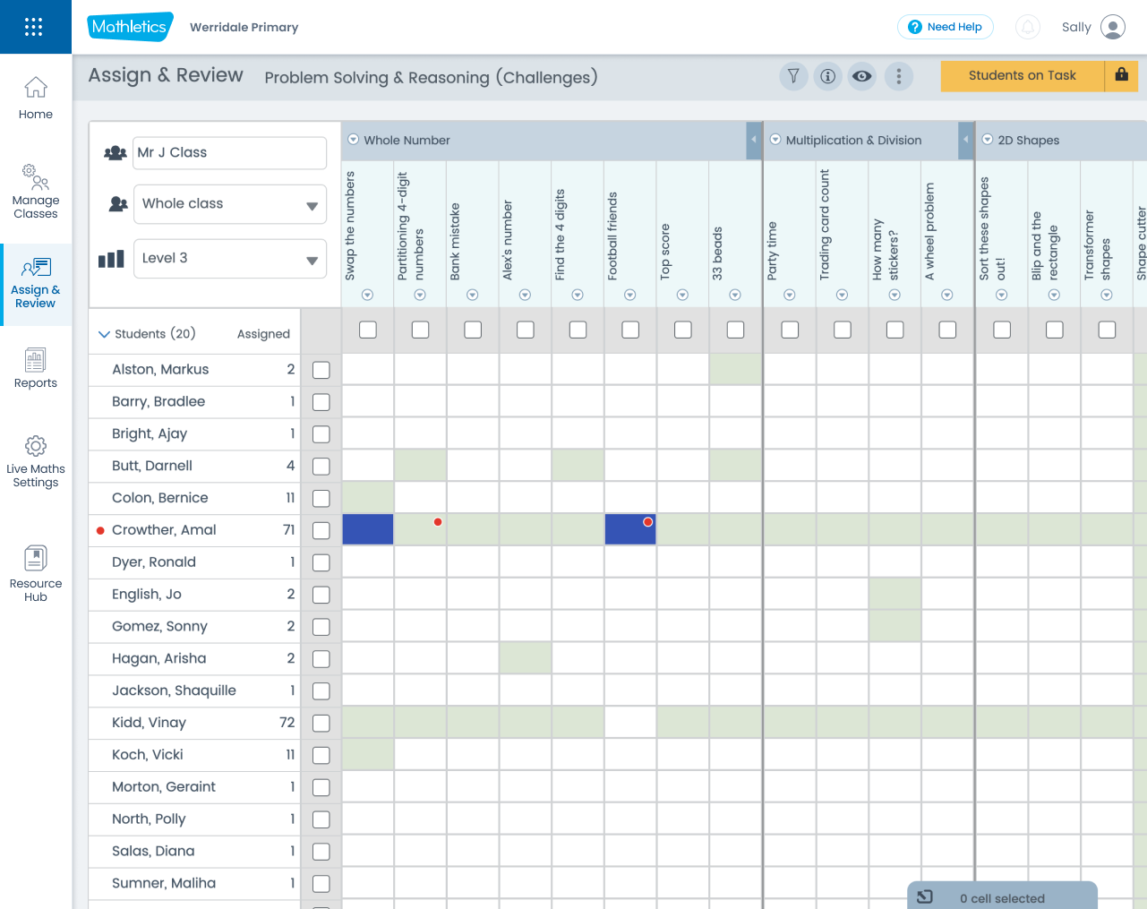
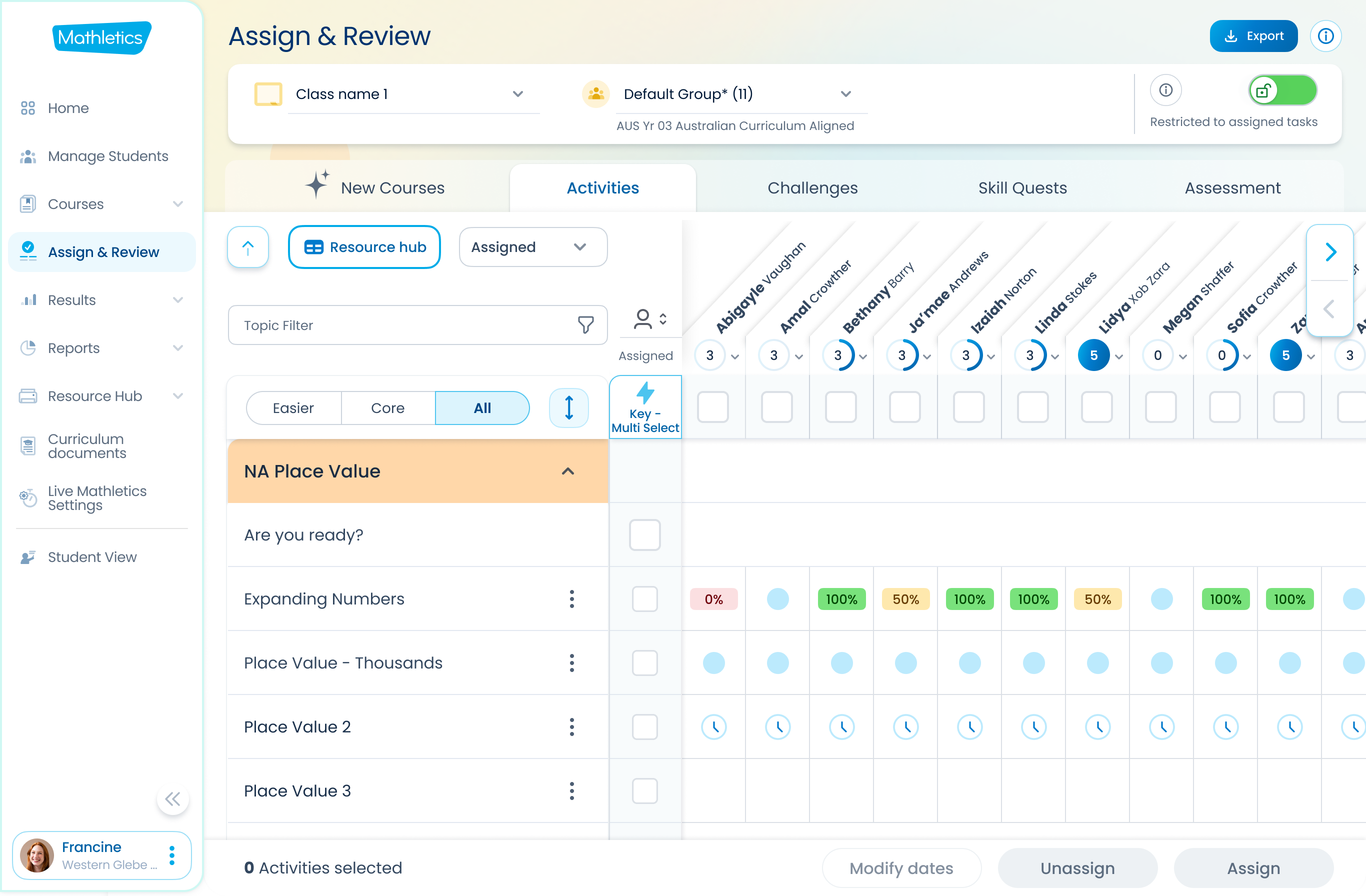
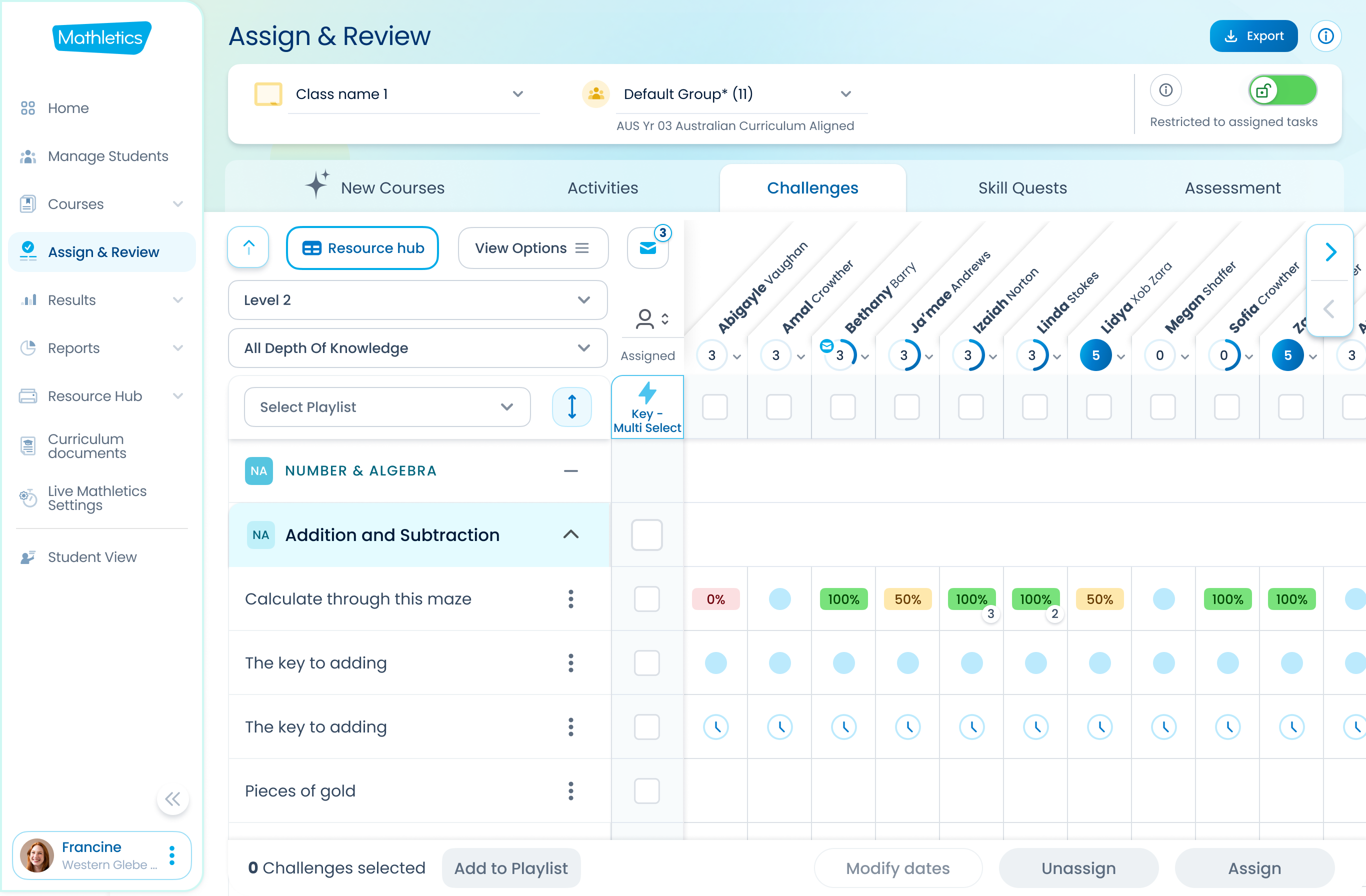
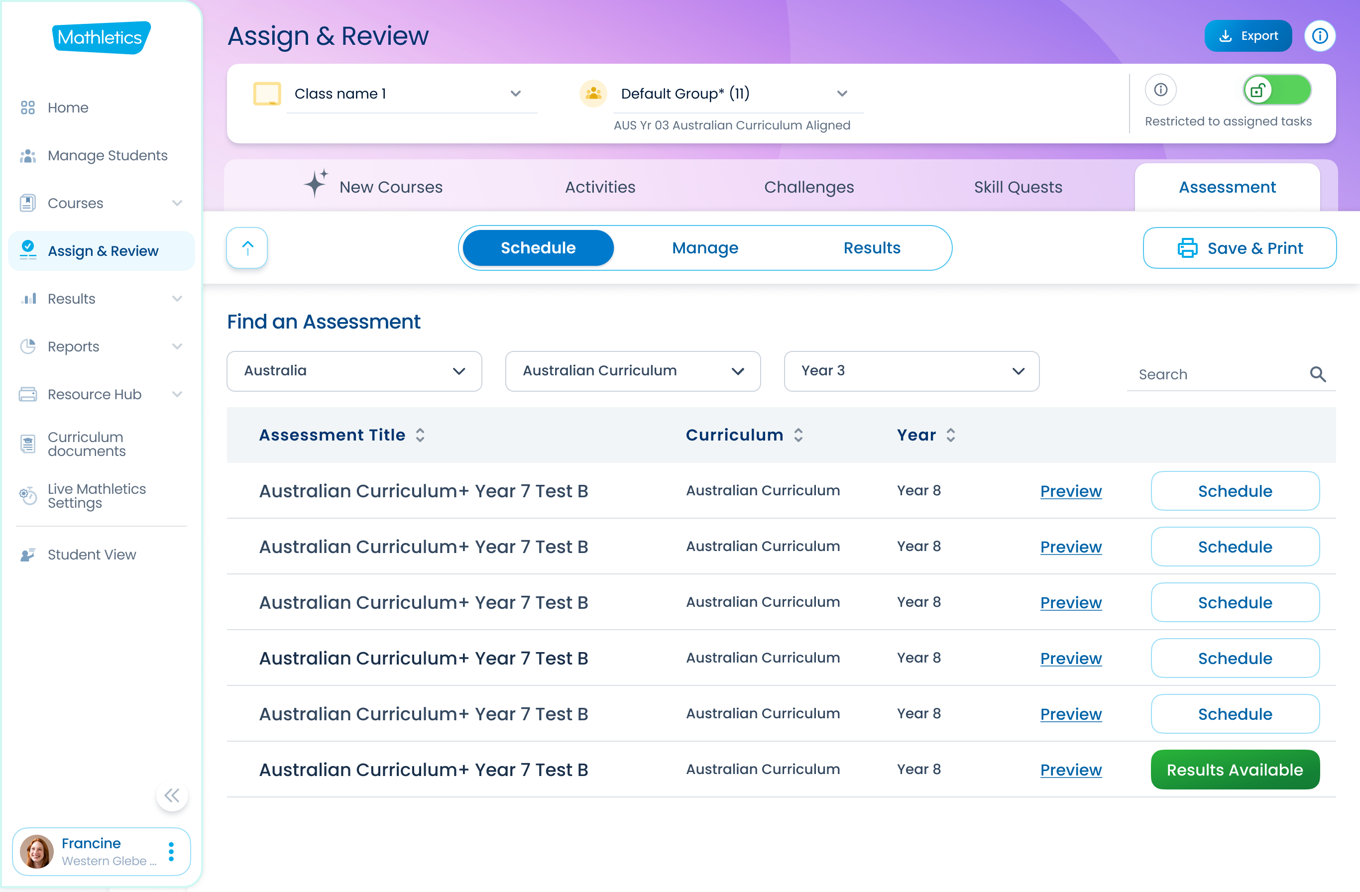
New
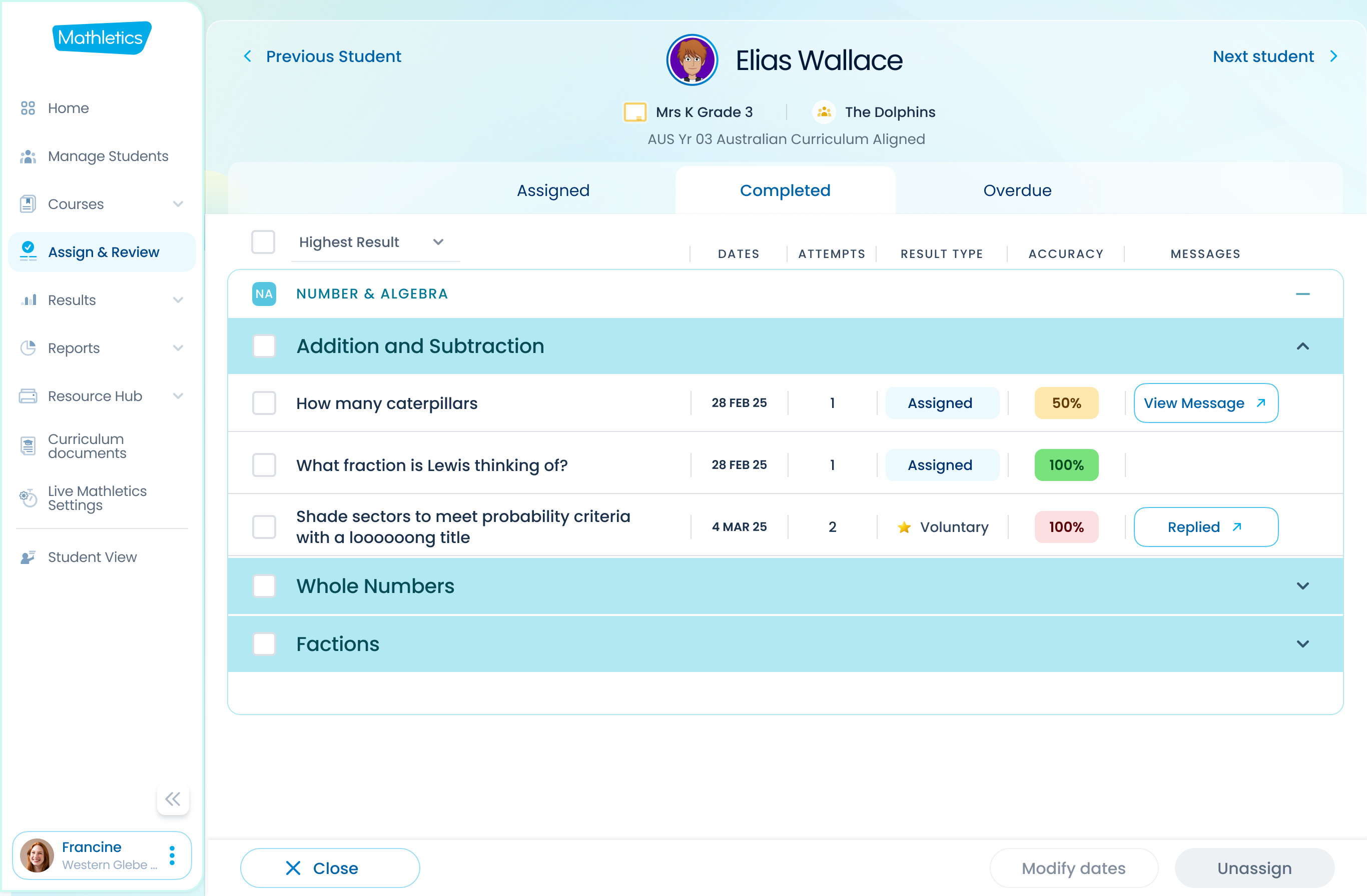
Streamlined Assignment Workflow Centralized "Assign & Review" section with clear tabs for "New Courses," "Activities," "Challenges," and "Skill Quests."
A grid-based view allowing for quick assignment and clear visibility of student progress on specific tasks (e.g., 100% completion indicators).
Streamlined Assignment Workflow Centralized "Assign & Review" section with clear tabs for "New Courses," "Activities," "Challenges," and "Skill Quests."
A grid-based view allowing for quick assignment and clear visibility of student progress on specific tasks (e.g., 100% completion indicators).
Activities
Challenges
Assessments
Enhanced Student Progress Tracking
A dedicated "Individual Student Progress" view allowing teachers to see assigned, completed, and overdue tasks for each student, including due dates, attempts, and status. This directly addresses the critical teacher feedback about tracking homework.
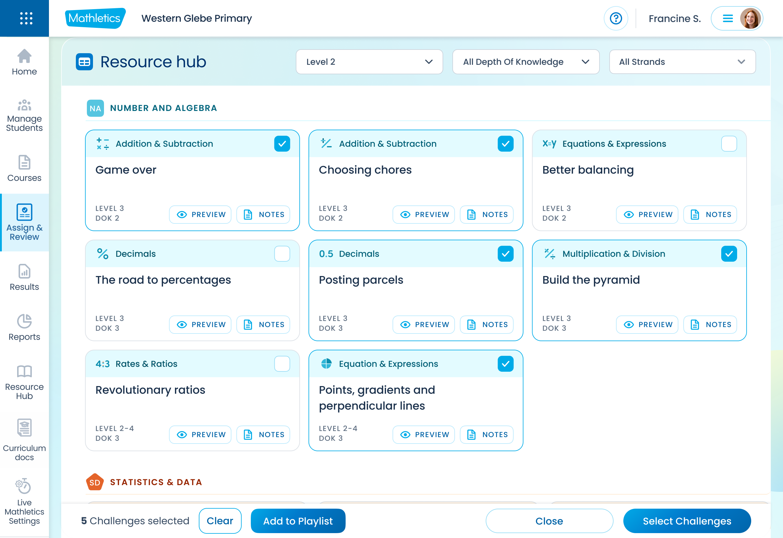
Resource Hub
A well-organized, searchable Resource hub with clear categories, previews, and teacher notes would empower teachers to curate activity playlists for term planning, student support, or specific curriculum standards.
04
Deliver (Implementation & Testing)
This final phase focuses on bringing the designs to life and ensuring they meet the intended objectives. While the full implementation details are beyond this case study, the comprehensive designs and prototype serve as the blueprint for development.
Approaching this as a holistic project helped us see the complete picture and continuously iterate and improve while building in phases. Our first and foremost important part was the "Assign & Review" feature.
Collaboration: Working closely with development teams to ensure accurate implementation of the designs.
Testing: Conducting usability testing with teachers to gather feedback on the new designs and iterate as needed.
Monitoring & Iteration: Post-launch, continuously monitoring user behavior and gathering feedback to identify further opportunities for optimization and improvement. (Hotjar)
Upon the launch of the "Assign & Review" feature, we received overwhelmingly positive feedback from our customers. Hotjar videos consistently reflected this success, showing zero rage clicks and confirming that assigning tasks is now a breeze. We are now focusing on launching and improving the "Reporting" and "Results" functionalities.
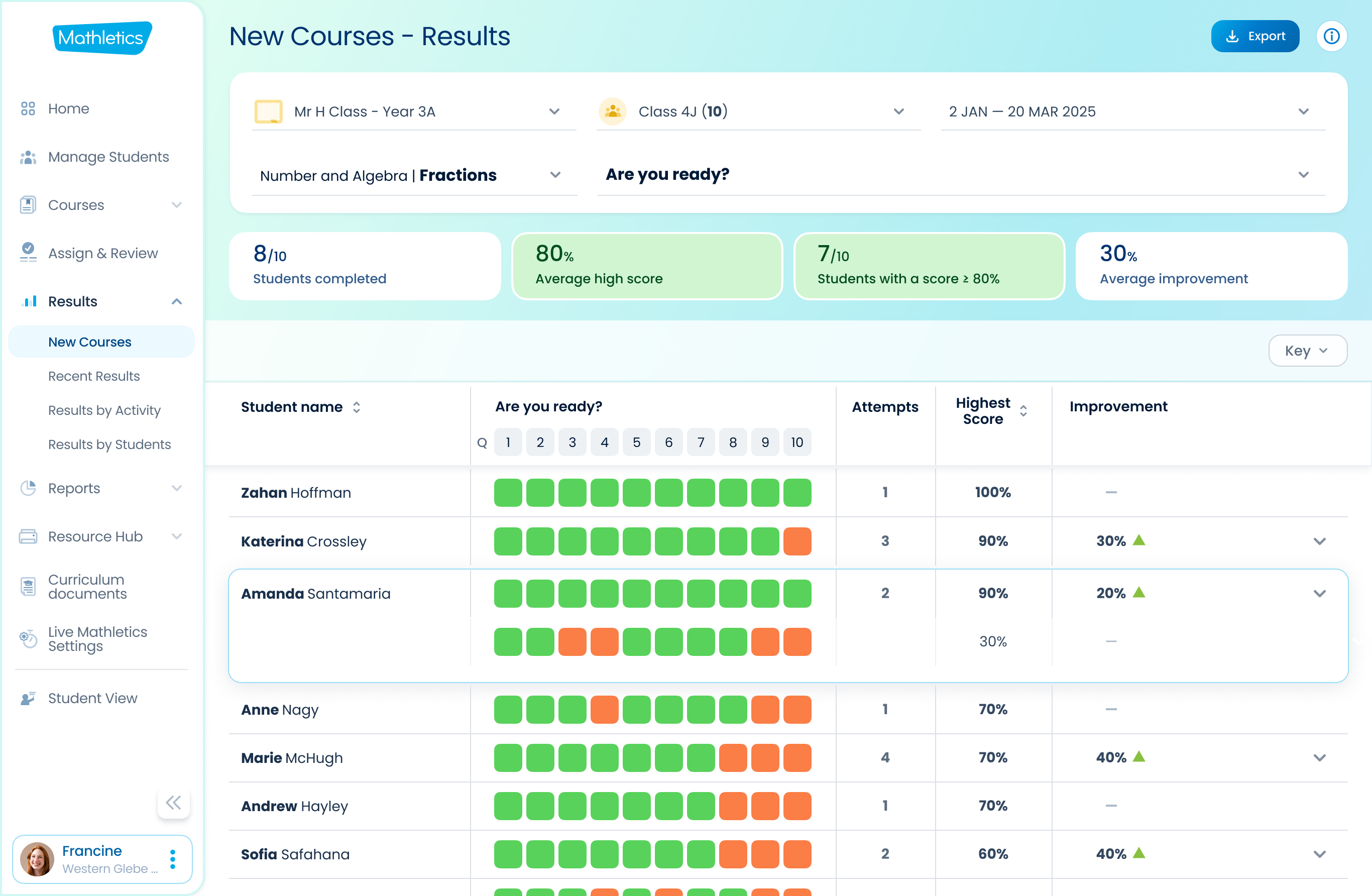
Results
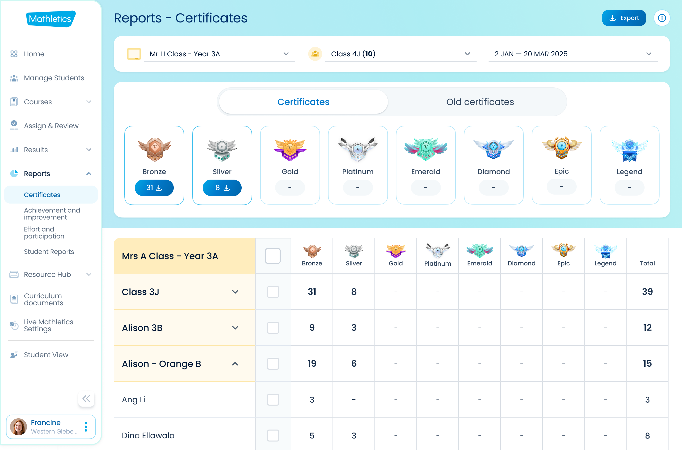
Reports
Impact & Outcome
The redesigned Teacher Centre, with its simplified assignment process, improved reporting, and real-time student progress tracking, is poised to deliver significant benefits:
Increased Teacher Efficiency:
Teachers can now assign tasks quickly and consistently, reducing frustration and saving valuable time.
Enhanced Student Progress Visibility:
Real-time tracking empowers teachers to provide instant feedback and adapt their teaching strategies based on performance data, fostering a more dynamic learning environment.
Improved Teacher Satisfaction & Retention:
By directly addressing key pain points and providing valuable functionalities, the redesign aims to increase teacher satisfaction and minimize churn.
Consistent User Experience:
The new design brings much-needed consistency across the platform, making it more intuitive and delightful to use.
This project demonstrates a commitment to user-centered design, transforming a fragmented legacy system into a streamlined, efficient, and engaging platform for educators.
We appreciate you taking the time to read this.
Keep an eye out for future updates!
Keep an eye out for future updates!
Hi there 👋 I’m Raza
Your business challenges are our design opportunities. We combine human-centered design with data-driven insights to deliver results.
Experience >
For 10+ years, I've been designing products that delight users and drive business growth.
My focus is on creating simple, impactful experiences that deliver long-term value.

You can reach me via Email : razataj@gmail.com