Mathletics—
Redesigning Student Centre
Research | UX | UI & Visual Design | Interaction Design | Design System
🌎️
Mathletics is the world's leading online mathematics program for school and home, used by over 3 million students!
Prototype for Secondary Student Centre >
Here’s the New design for Primary Students Centre.

Initial Brief
Our challenge — refresh the brand and the Student centre, fix the pains of current users, and get them re-engaged.
Auditing the current state.
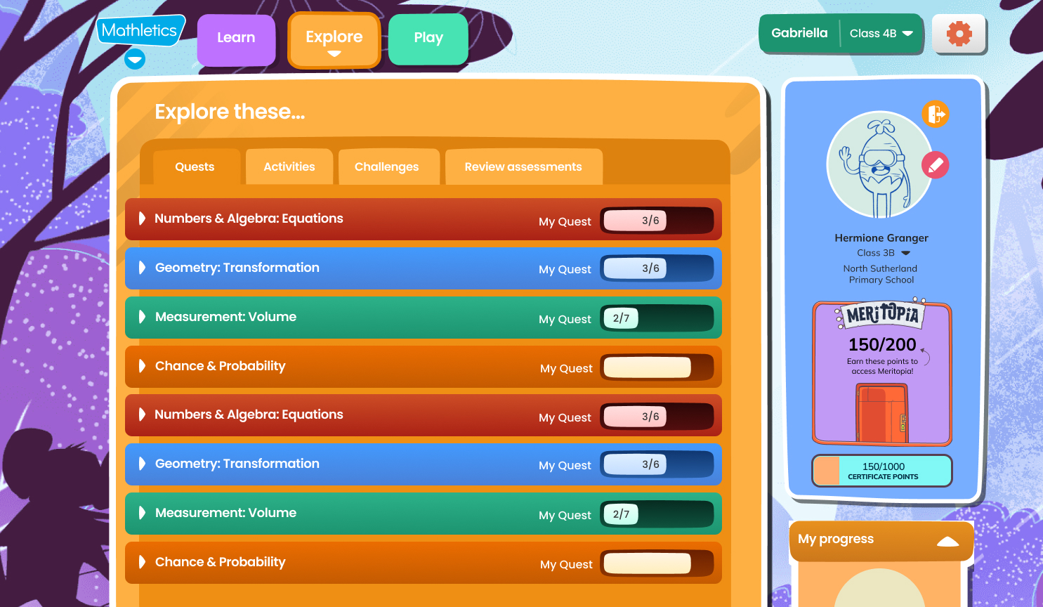
Upon auditing the existing design and interaction flows, we identified several major pain points and inconsistent components with varying behaviors. We also conducted a visual audit of the elements, styles, and color palette. The design's look and feel appears outdated and requires modernization.Key issues identified:
-
Structural problems: Content lacks proper organization and coherence.
-
Unclear information hierarchy: Important information is not easily distinguishable from less critical elements.
-
Misalignment between Teacher Portal and Student Center: There is no direct correspondence between these two key areas.
-
Inconsistency: Design elements and user interactions lack uniformity across the platform.
-
Suboptimal interaction design: User flows and interface interactions need improvement for better usability.
- Fragmented user experience: The overall user journey feels disjointed rather than seamless.
Screenshots
Here are couple of screens from existing build.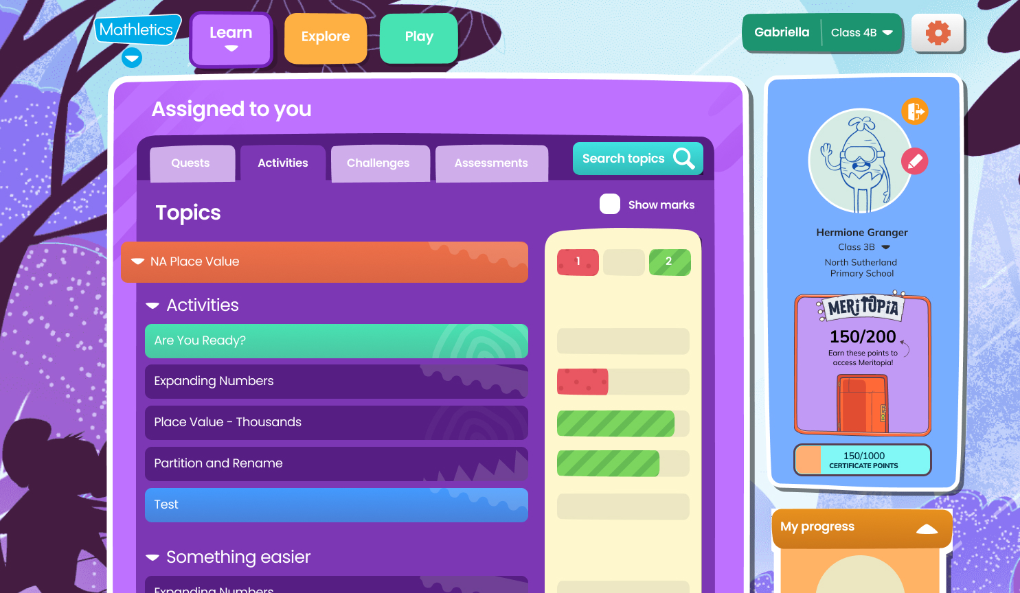


Competitive analysis
It's crucial to analyze the educational landscape and identify the learning products students are already using.


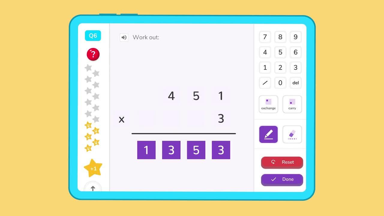
“The last best experience that anyone has anywhere becomes the minimum expectation for the experience they want everywhere.”
- Bridget Van Kralingen, Senior VP, IBM Global Business ServicesDesigning for Emotions - Delightful experience
There are many approaches but I think Walter’s hierarchy of needs really helped us out to design something which kids can appreciate the delightful aspect of the experience.
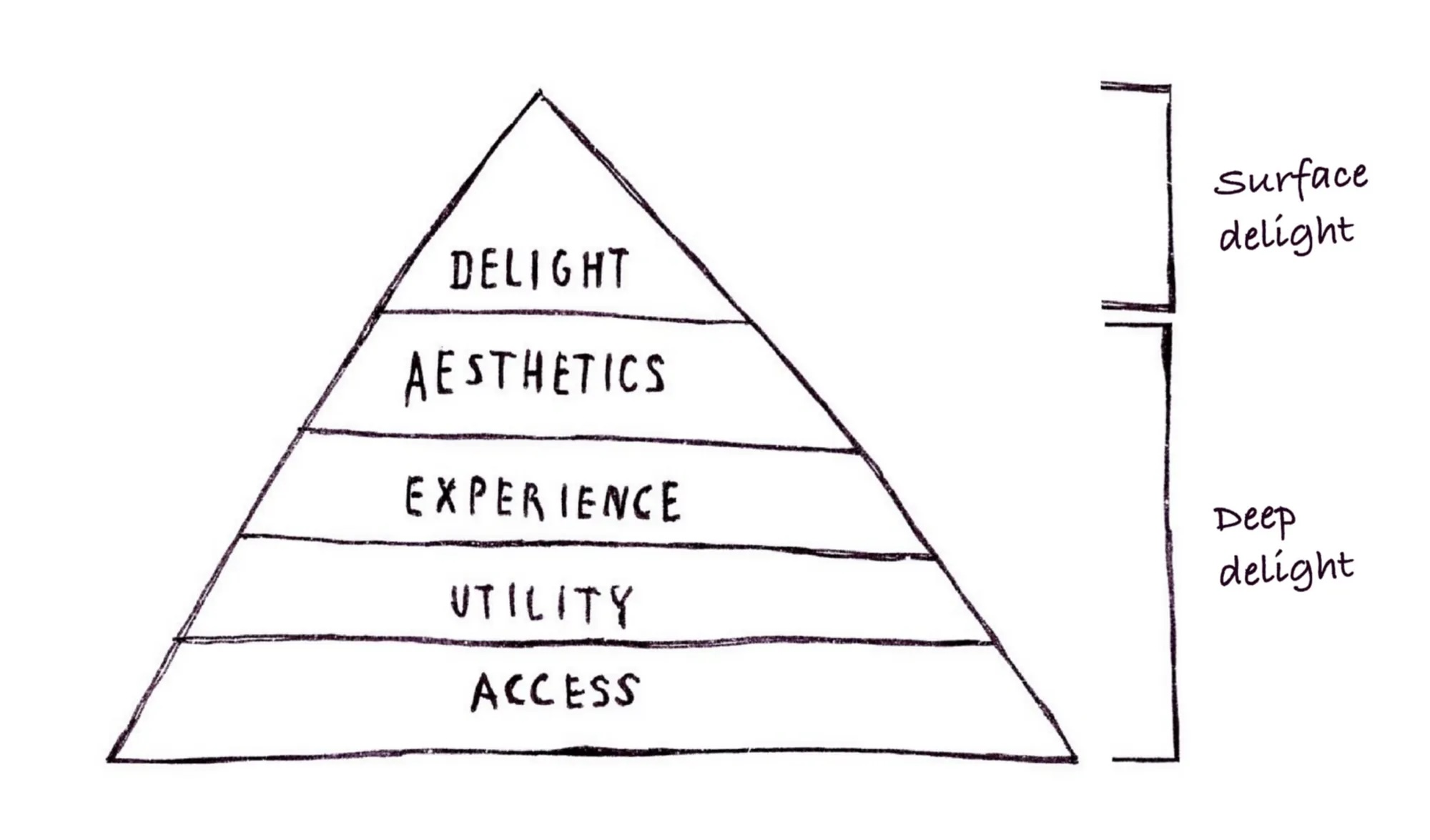
Deep delight
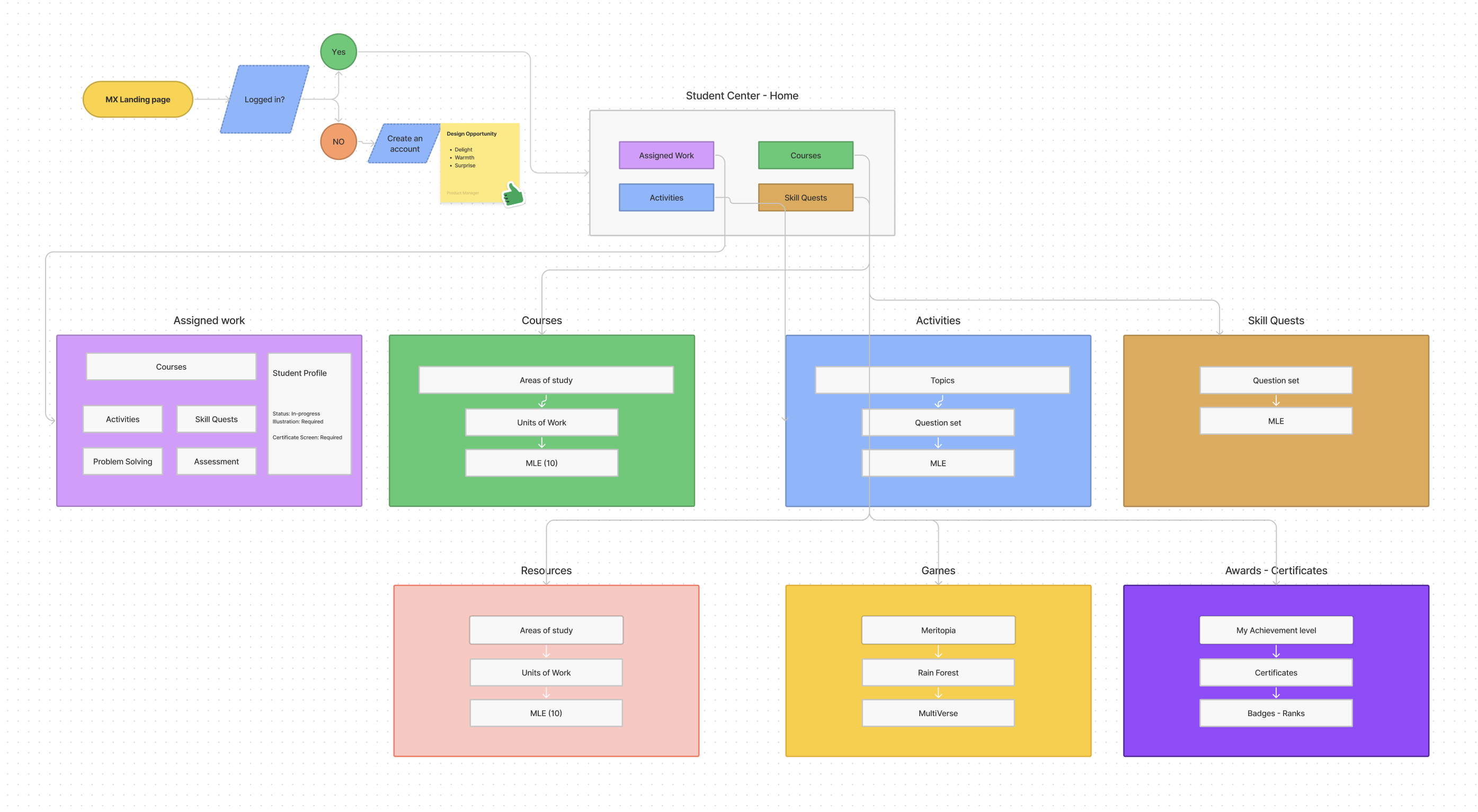
Our first priority is to address the structural issues by redefining the information architecture(IA). This process will create a comprehensive blueprint for the entire user experience.
A solid functional foundation is crucial, as it underpins all other aspects of the product. Without robust functionality, enhancements in other areas become ineffective.
Surface delight
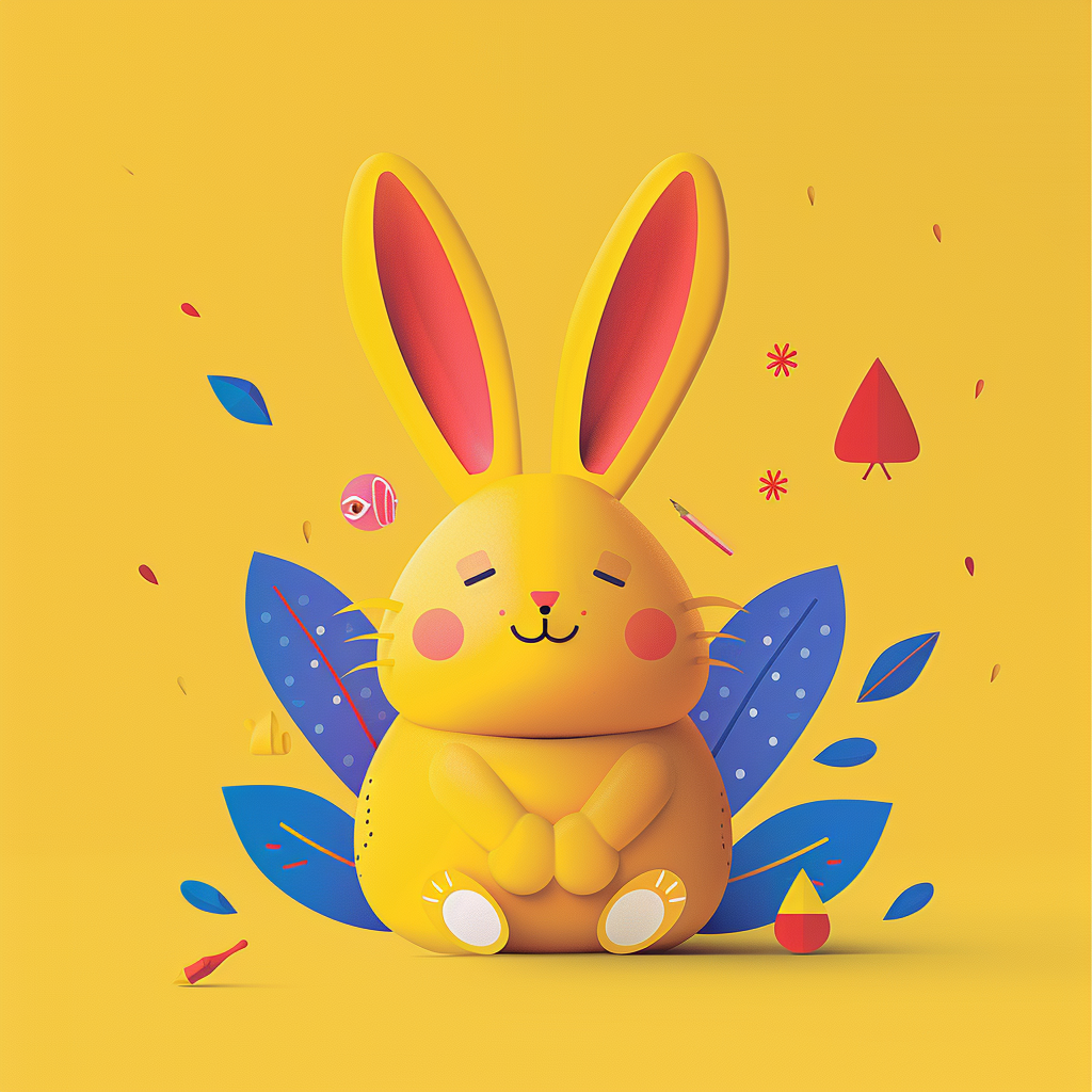
Surface delight consists of subtle design touches that go beyond basic functionality and usability. Things like:
-
Micro-animations (e.g., a playful loading animation).
-
Clever copy or microcopy (e.g., humorous error messages).
-
Visual feedback on interactions (e.g., a satisfying button press effect).
-
Easter eggs or hidden features.
-
Personalized greetings or recommendations.
- Playful illustrations or icons.
Target Audience
From our initial sessions, we recognized the diverse nature of our student body. The target audience spans a wide range, from kindergarten to tenth grade, with each student possessing unique needs, abilities and interests.
To reduce the gap the initial idea was to build 2 versions of the student centre.
1. Primary (K-4)
2. Secondary (5-10).
It comes with extra effort building and maintaining the system.
Interesting Challenge to solve....


Let’s explore some nice ideas and inspirations
This is great place to engage your team and get insights from the Target audience.
Defining look n feel of the project.
What moods we want to portray?
After our brains played ping-pong with ideas until they were dizzy, we started jotted down ideas:
It should be a visually rich style of background, ideally supporting micro-animations and subtle variations for interest and visual delight.
It should be a visually rich style of background, ideally supporting micro-animations and subtle variations for interest and visual delight.
Should feel fresh - friendly - exciting - vibrant - fun - soft and give a sense of motion and adventure/journey.
Since each activity is different - we can have different landscape or world for each.
Activities
After collecting heaps of inspiration from most popular video games, learning apps, we started experimenting it with card system.

Initial exploration
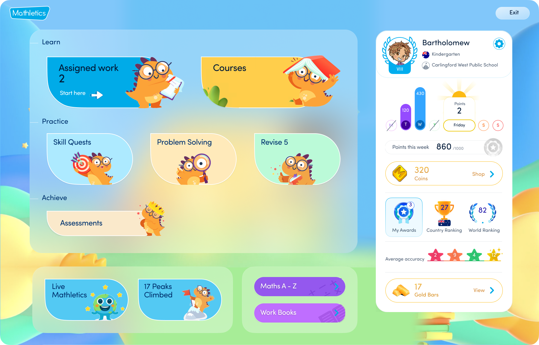


In collaboration with Penny, our Product Lead, and Katy, our Chief Product Officer, we determined it was the right time to engage Stephen Cooper, our amazing illustrator. We tasked Stephen with exploring visual concepts for individual journey activities.
And pretty good start 😍️
![]()
And pretty good start 😍️

wait!
What about personalised experience?
Product should adapt to individual students needs and interest.
Introducing change background to help personalised your screen with 100’s of unique, cherry picked for students by students.

Select your scene, superstar!
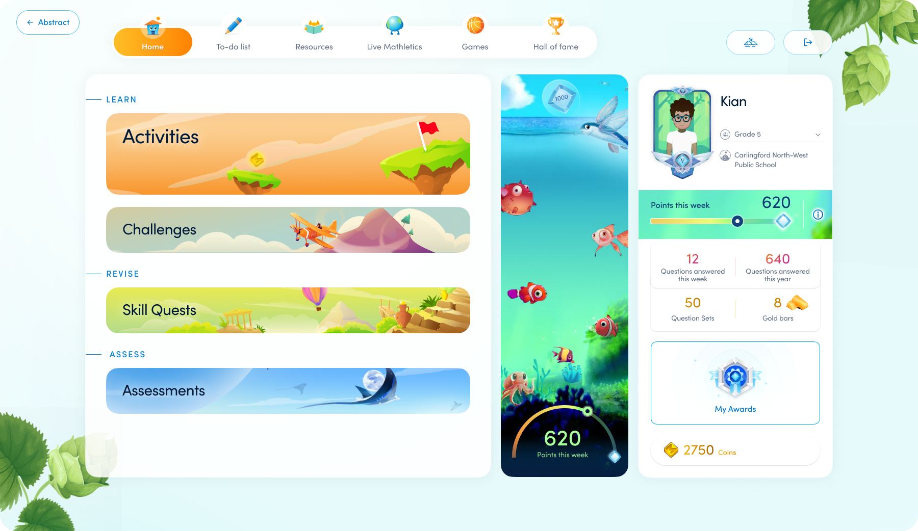


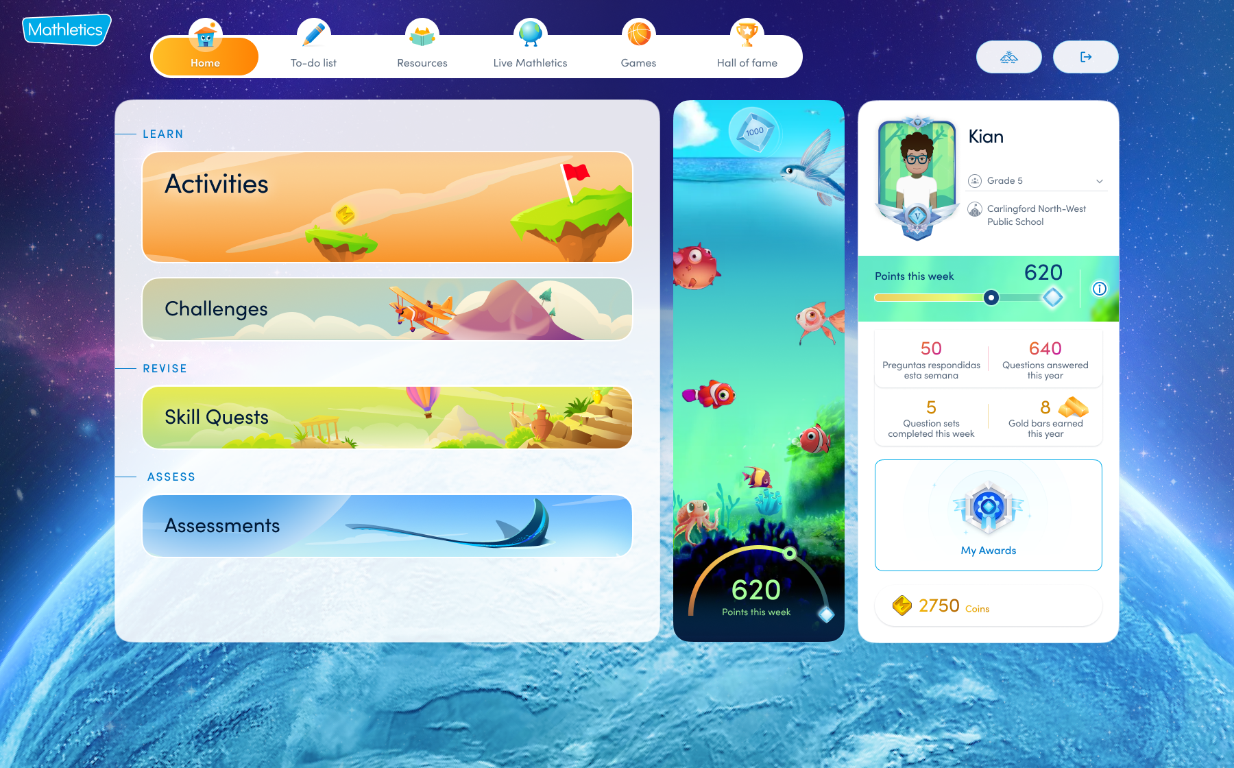
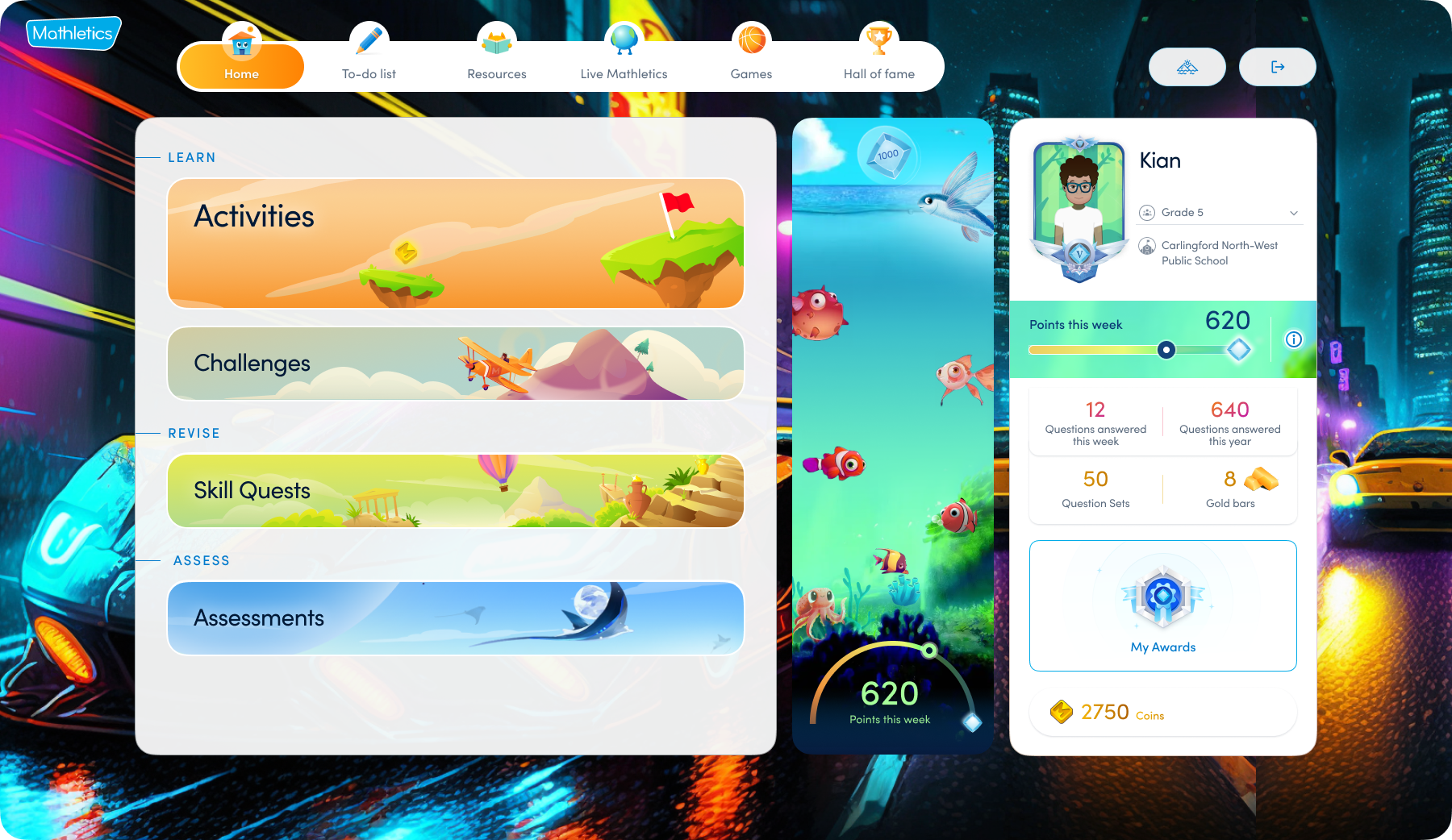
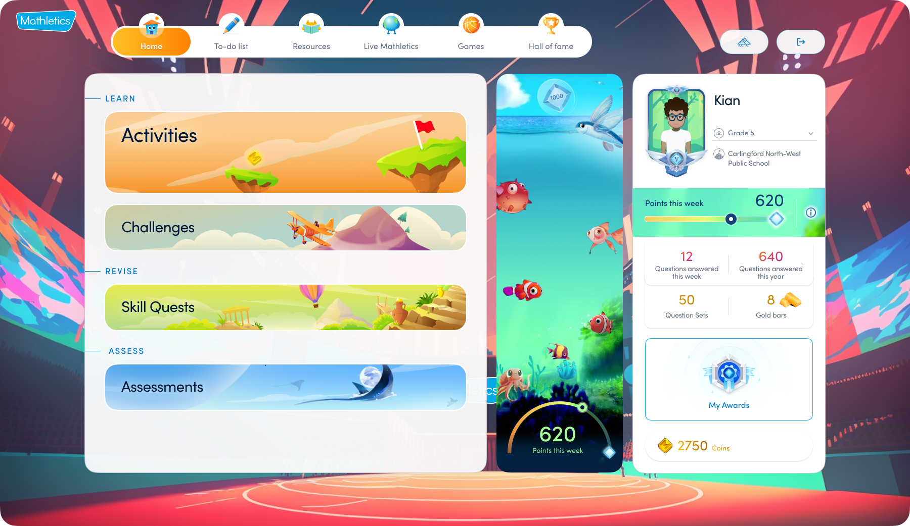
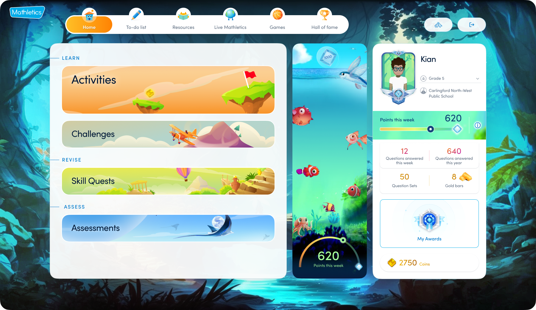
All the images are generated using Midjourney AI
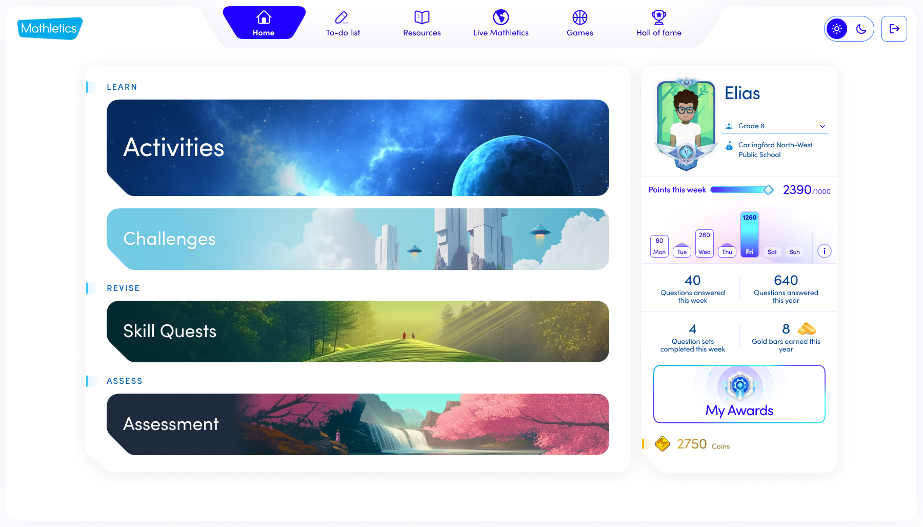
Leveraging our existing structural framework, we are redesigning the UI to create a more mature and engaging aesthetic, optimized for Secondary Students.
Thank you for taking the time to read the case study - Please reach out if you have any queries.
