3P Learning
New customer onboarding flow

Role:
Lead UX/UI Designer
Team:
CMO, PM, BA, ECMS, Engineers, Junior designer, Sales and Marketing team.Tools & Methodology:
Figma, Miro — Design Thinking (Double Diamond), Research, Auditing, Stakeholder Interviews, Data Synthesis, Customer journey map, Value Flow and User Testing.
Impact & Outcome:
Our analysis revealed that most Readiwriter spelling trials weren't converting to paid subscriptions.
Initially, we thought "Rostering" (getting class details into the product) was the only issue, but we soon realized the entire onboarding experience was lengthy, confusing, and lacked guidance.
We tackled this head-on by redesigning the trial flow to highlight differentiation and customization. In under 3 minutes, triallists get a guided, active tutorial showcasing features like intelligent recommendations for learning groups and courses, plus a "Quick Set" scheduling function—all with no effort on their part.
Crucially, we built in moments for them to explore the student experience, a key feature teachers were eager to assess for product strength and unique selling points which was previously lacking(Differentiation and Customisation).
This comprehensive approach, featuring streamlined customer journeys and scalable design systems, led to a remarkable 70% increase in trial-to-paid conversion.
Live flow >
Initial Brief
Simplify and solve ‘Rostering’ first as it’s the highest priority issue.
Initial assumption
Available data showed that most trials of Readiwriter spelling were not converting to paid subscriptions. Although there was a general understanding that the overall triallist onboarding experience for Readiwriter was lengthy, confusing and lacking in sufficient guidance or direction, the initial assumption handed to us was that we just needed to solve “Rostering” (i.e. how a teacher gets their class details into the product).

The initial investigation
Initial investigations including data reviews, interviews, usability tests and collaborative walk-throughs identified 2 Key problem statements:
- Not being able to get into and experience the product quickly without a lengthy signup process and a great deal of administrative overhead; and
- Not being able to quickly and easily access the student experience to explore how it will engage students. Even teachers who reached the student console were not able to fully experience it as a student would with reward mechanisms.
Reviewing the current state
Current user flow
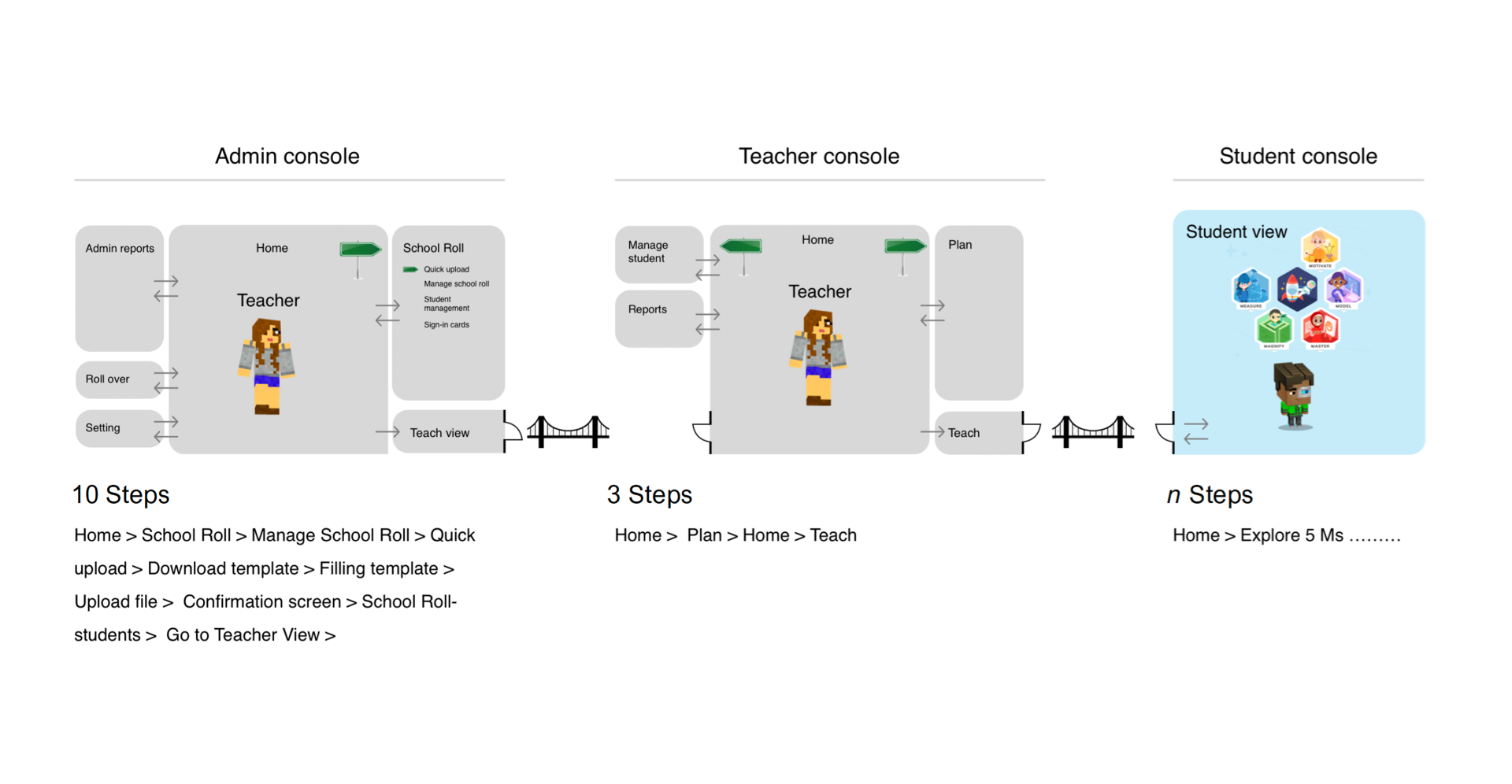
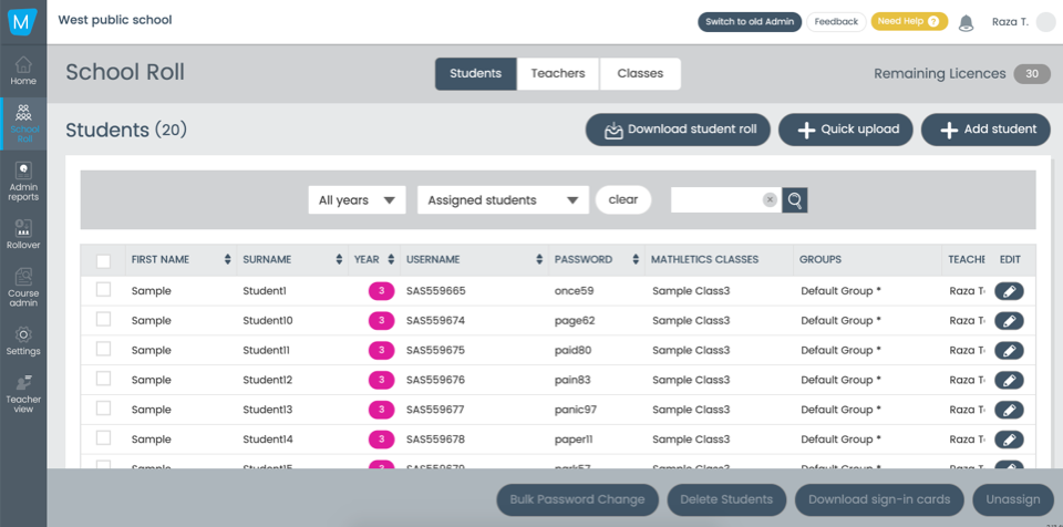
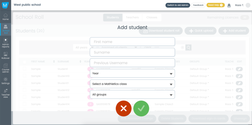
The first thing we did was map out the current onboarding flow and audited the screens. We identified 13 steps (some of which were complex, e.g. Rostering) before a teacher was able to explore the student console.
On average it was taking a customer 5-9 mins just to sign up (3 forms and 2 email verifications!)
On average it was taking a customer 20-38 mins to assign activities to students and open the student console.
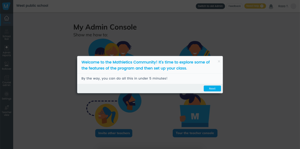
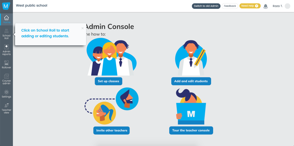
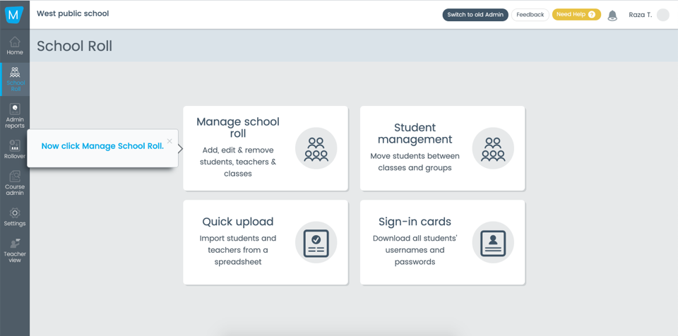
Audit of current screens
We audited all the screens and user-flow. Identified where the problem lies and make note of it.
Qualitative data
We collated qualitative data by conducting user testing and collaborative walk-throughs during which we observed the user’s behaviour and also asked them to voice their thoughts about what they were seeing and trying to do.
Overwhelmingly, the feedback was that the process was too long with a heavy administrative overhead before they could even experience the product. Add to that the confusing UI and lack of direction making that administrative work all the more difficult.

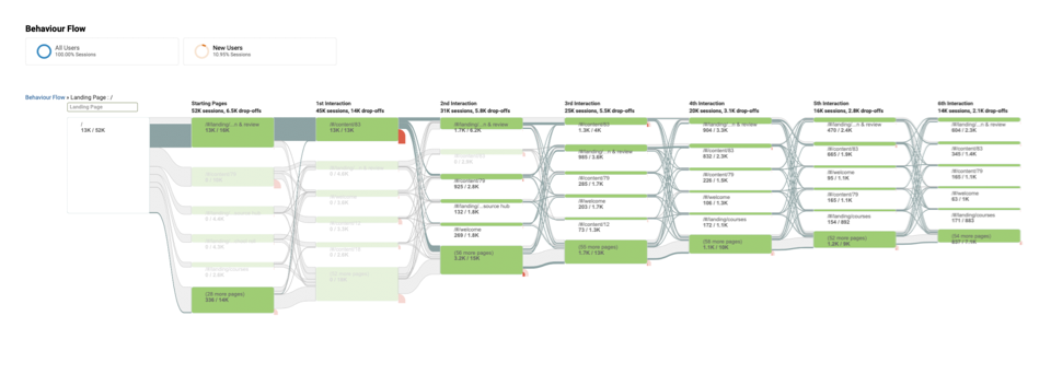
Quantitative data
We reviewed data analytics to identify drop-off points and saw a common circular pattern. It seemed from this that customers were consistently visiting certain pages but abandoning them quickly.
Combined with our qualitative data, it reinforced our growing theory that the onboarding process and the system UI were simply too complex for a first-time user to navigate easily.

Research Findings
We were able to distil our research findings into three main issues:
- The account set-up phase was too long and diverted the user’s attention away from their task (trying out our product) to email not just once, but twice.
- Once on board (for those that made it), there was considerable confusion as to how to proceed. Customers kept reporting they just wanted to try it out, especially the student experience, and couldn’t see an easy and quick way to access it.
- Identifying how the students would be engaged by the product was the most important outcome of the trial.
Insights

The Refined Brief
With everything we had learned we were able to refine the brief to what really mattered.

How can we get the teacher experiencing the product as quickly as possible and provide value on each step.
Value Flow
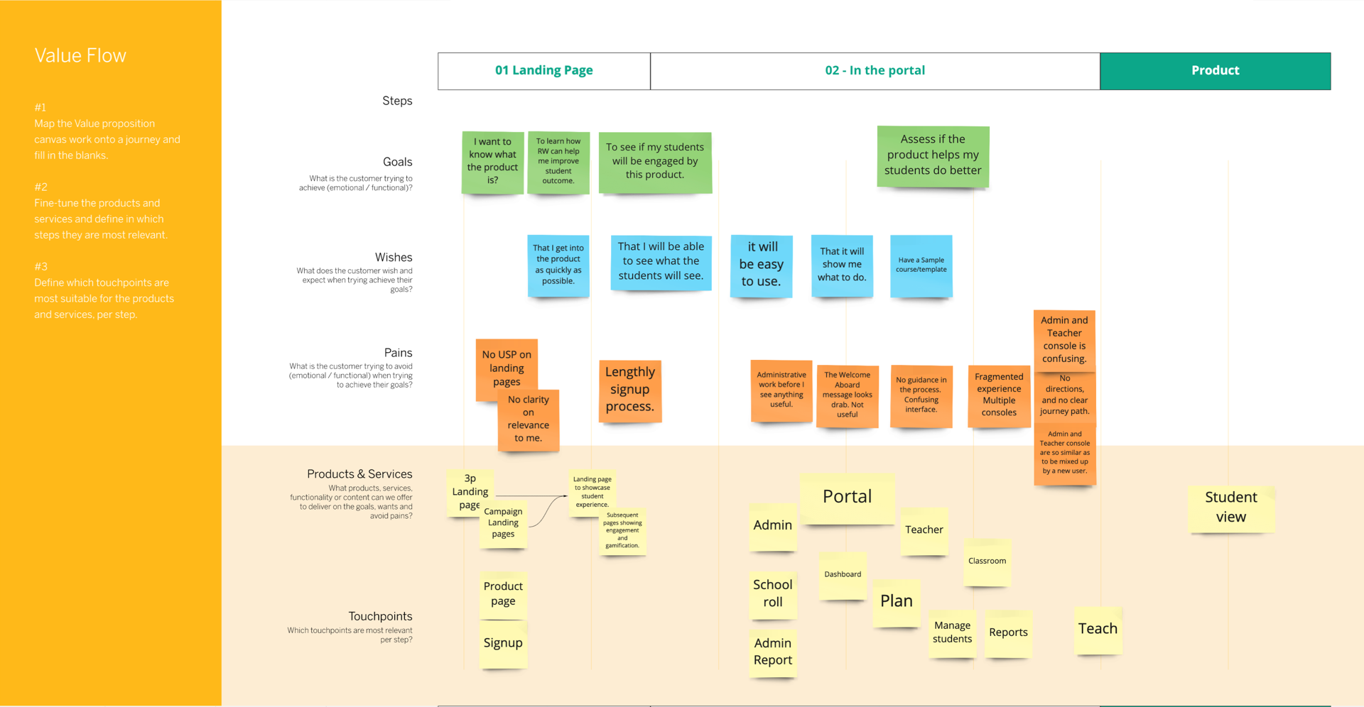

New account creation
Reduce and prioritise the number of data fields required in the account creation process.
Create functions within the product to capture additional data implicitly during onboarding and product usage.
Take the customer directly from the sign-up page to the main landing page in the product.
Use an API-based email validation service.

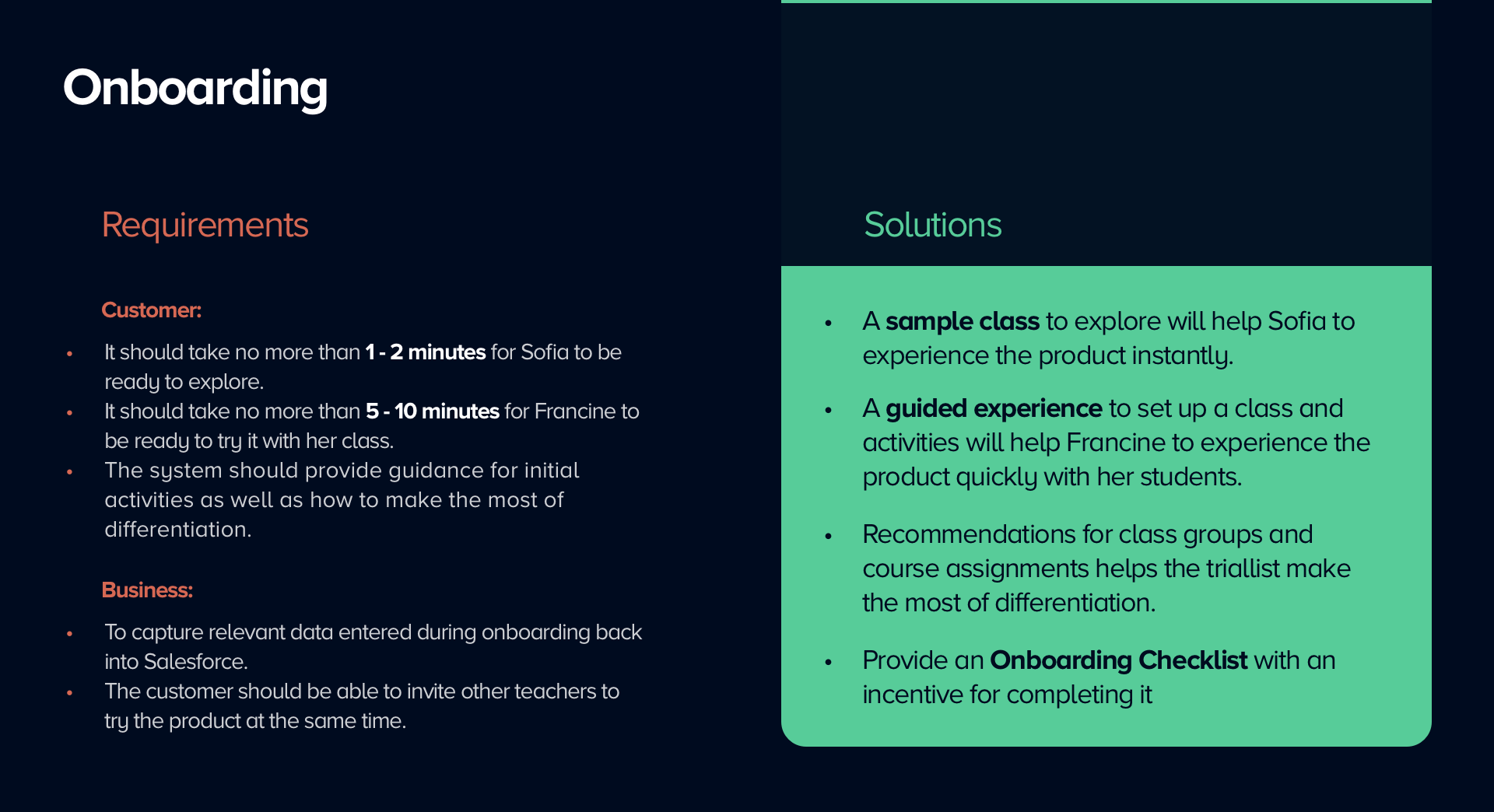
Onboarding
Create a sample class to allow the customer to experience the product without any administrative overhead.
Provide a guided experience to set up classes and students quickly and easily.
Provide an “Onboarding Checklist” to ensure the customer always knows the next best action and to highlight all the areas and functions to explore during the trial.
Make recommendations for class groups and course assignments to showcase the USP of Differentiation and Customisation.

Product
Add a website page to display examples of the student experience and highlight the engagement features.
Make it clear and easy for the customer to view the Student Console as quickly as possible.
Allow the customer to impersonate a student to see the full experience including reward mechanisms.
Now that we had a research and data backed brief.......
We created a Persona
Persona
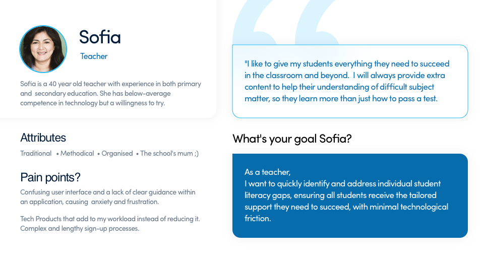
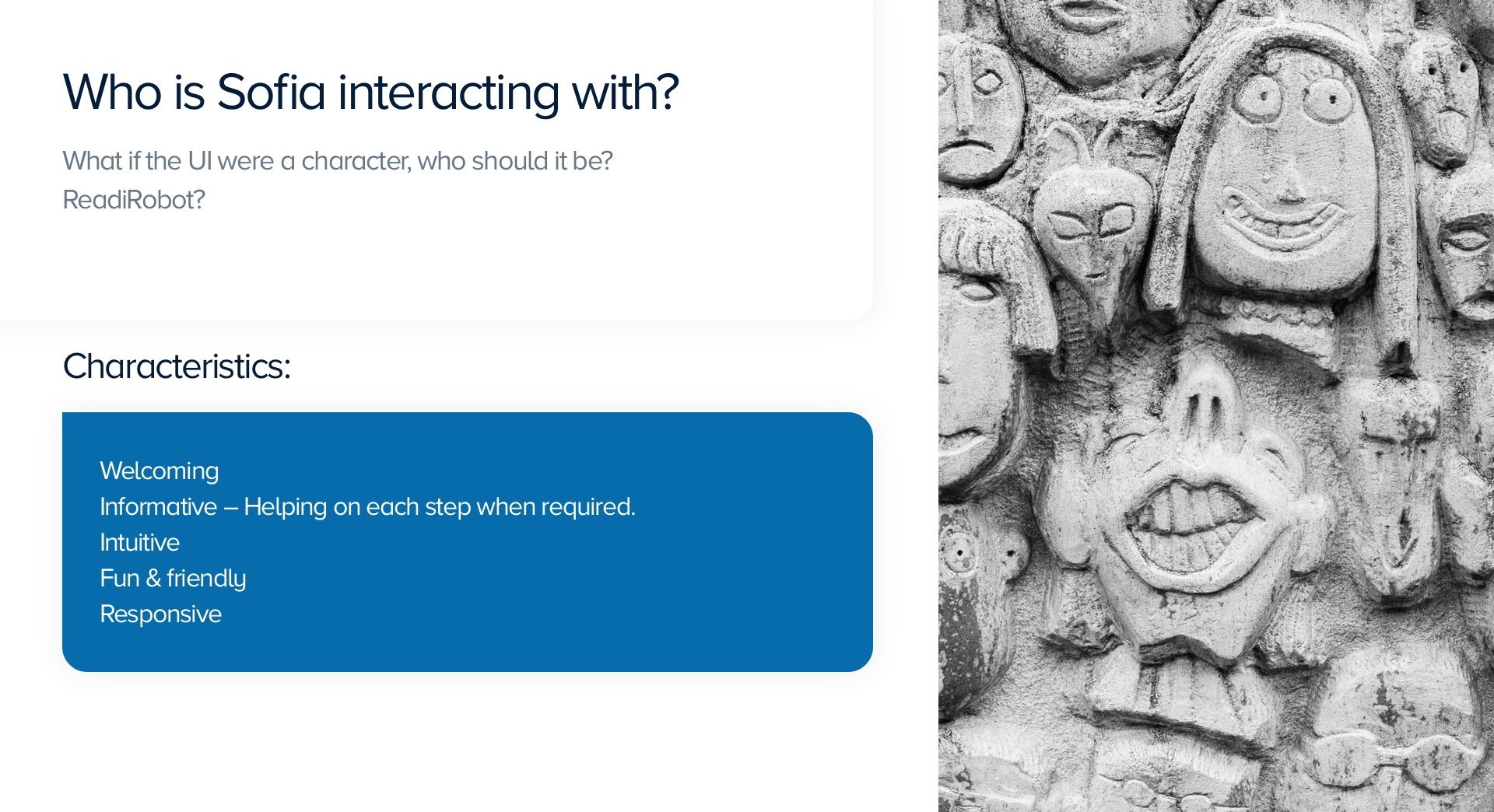
Characteristics of User Interface
Guiding Principles
During our solution research (including competitor analysis and user feedback on early wireframes), we identified the following functional and design principles that formed the basis of our final solution:
- Don’t divert the customer’s attention from their chosen task (e.g. diverting a customer to email before even letting them into the product).
- When inside a user flow, display a stepper to indicate where the customer is up to.
- When offering a choice to the customer, map each choice to an easily understood scenario.
- Always provide a Next Best Action for the customer.
Always provide an escape route out of a user flow.
- Always aim to introduce and highlight features in a logical, contextual and organic way.
- The system should be responsive on many levels. This includes web responsiveness as well as contextual information, element interactivity, etc.
- Think of the UI as a character who is welcoming, helpful, intuitive, fun and friendly.
- Always aim to include some visual delight.
Proposed Solution


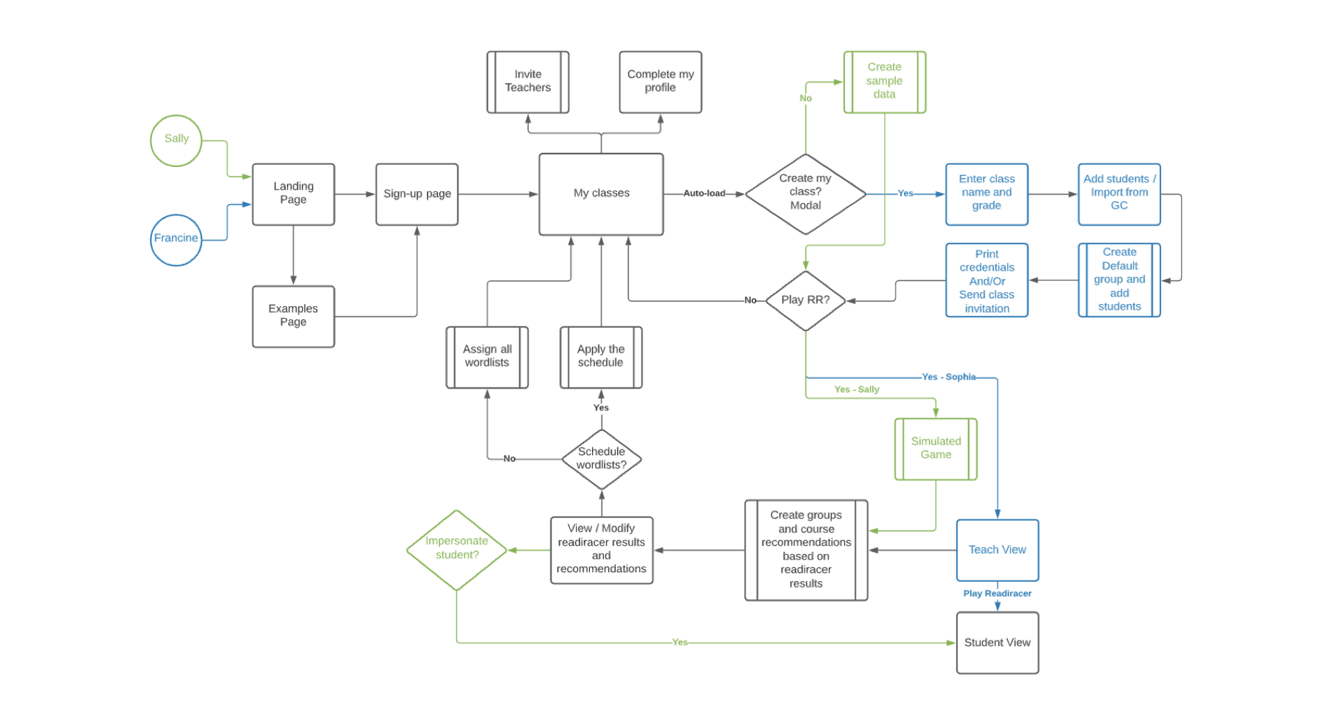
Proposed onboarding journey for all personas
Vision
The Vision for the new trial onboarding flow is to take the USP of Differentiation and Customisation and showcase it to the customer via a guided experience.
In addition, the vision proposes taking the USP to the next level by providing recommendations for creating learning groups and assigning suggested courses, and incorporating a “Quick Set” scheduling function for wordlists and courses.
Lastly, the vision provides moments throughout the guided experience in which the triallist can enter and explore the student experience.
All of the these features can be showcased to the customer in under 10 minutes via an Active tutorial journey using sample data and simulated activities; i.e. with no effort on the part of the triallist.
A more comprehensive journey is available in which the triallist can enter or upload their own class details, (with guidance and with the option to integrate from Google Classroom), engage their students in an activity and receive the same learning group and suggested course recommendations based on the student’s performance. With a few clicks, they can apply the schedule to the chosen courses for each group and set a term’s worth of activities.
Wireframes
We translated the new customer journey into wireframes and used these to refine the features & understand the behaviours and edge cases.


Credits
Special thanks to Louise Mclennan (Product Owner/BA) for being an awesome partner; helping/collaborating through out the project. We both took the lead and pulled off the project together.
Also, Mark (Education Content Marketing Specialist) for helping us with the copy and invaluable ideas.
Thank you for watching.
— A Product Designer who thrives on collaboration and finding creative solutions to complex problems. I work with teams to turn messy problems into seamless experiences that feel good, work beautifully, and deliver real results.
Simple, human, and always outcome-driven.

You can reach me via Email : razataj@gmail.com